Redesigning ET. An idea page.
Goals:
- NEW ENTRANCE IMAGE
- Updated logo
- Unify graphics
- Simplify
- Remove unnecessary clutter
- Make ET more 'new user' friendly
- Redesign navigation
Technical requests from an iippo:
-all buttons to be done via stylesheet, no images living in a hrefs
-not so many tables, more CSS-based arranging
-divs/importan
t elements to have unique ids @_@
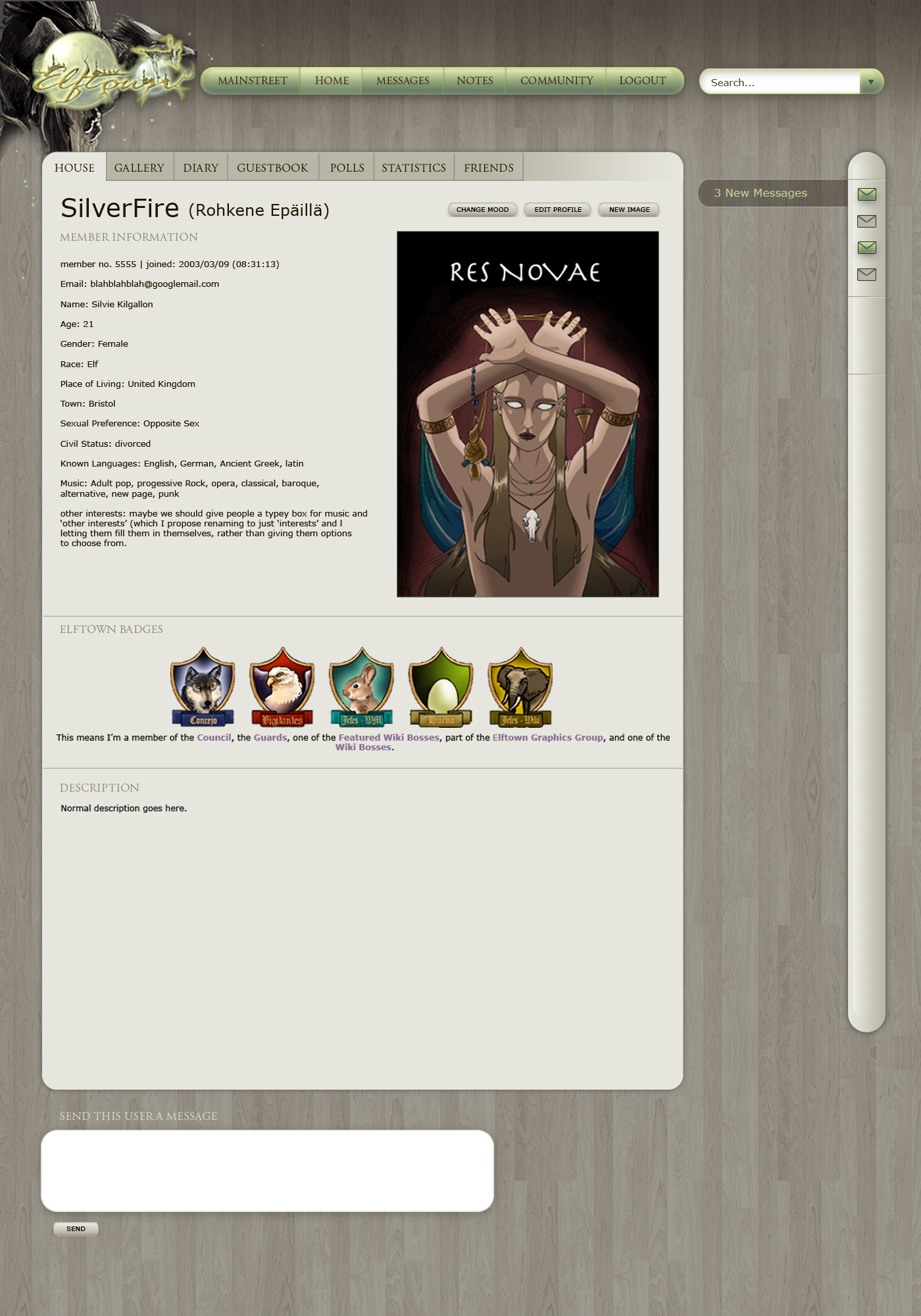
This is the re-vamp [True, plain and simple] was working on before he left.
http://elftown.heddate.com/_Elftown%20Mock-Up
Yncke's suggestion: Suggestion for a UI change
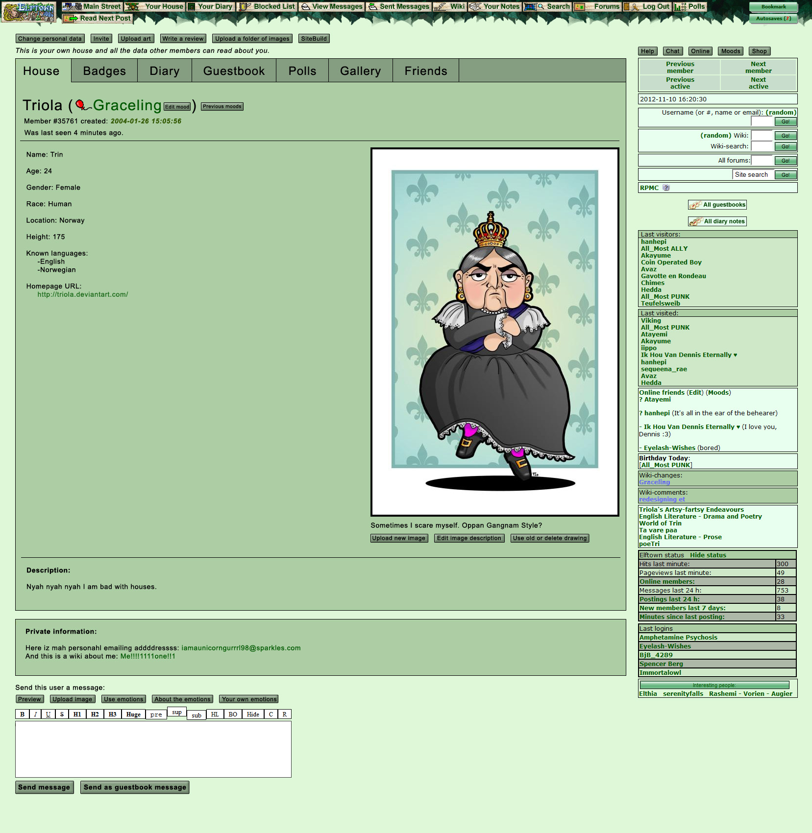
[Chel.] - I hate how un-unified the graphics look. There are 3 different kinds of leaves! There is the cartoony ones on the left, the realistic ones on the top and the pixel ones on the right. It's like they were rendered at different times by different people! >_>'

[NOOOPE]
[NOOOPE] made the following and I thought it should be put up here. -[Chel.]

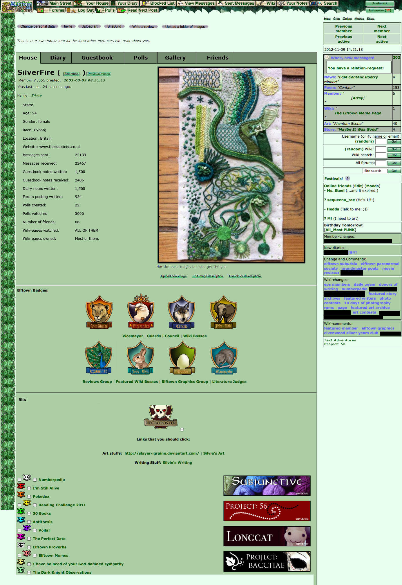
Note: some of this has been sorted now: there's no longer a doubling of all features on Main Street, but it's still pretty long, and there are lots of (what I suspect are) barely used links. At the very least the links need to be rearranged (and probably some removed - or moved somewhere else other than Main Street). I'm still thinking about other ways to try and make it shorter - [windowframe].
[Kaimee] I am currently using my own stylesheet which reskins the existing site, which is much nicer. However it's still not enough, I would like to entirely redesign the site, simplifying it, cutting out the hundreds of extraneous links and buttons on every page, and making it more user friendly and graphically oriented.
My current stylesheet: _kaimeetest.css

[windowframe]


Note: on the view of the wiki edit form, all the current options for password protection, forum protection, keywords, etc. would still be there. I just forgot to add them because I wasn't planning on changing them. <_<

[Kaimee]
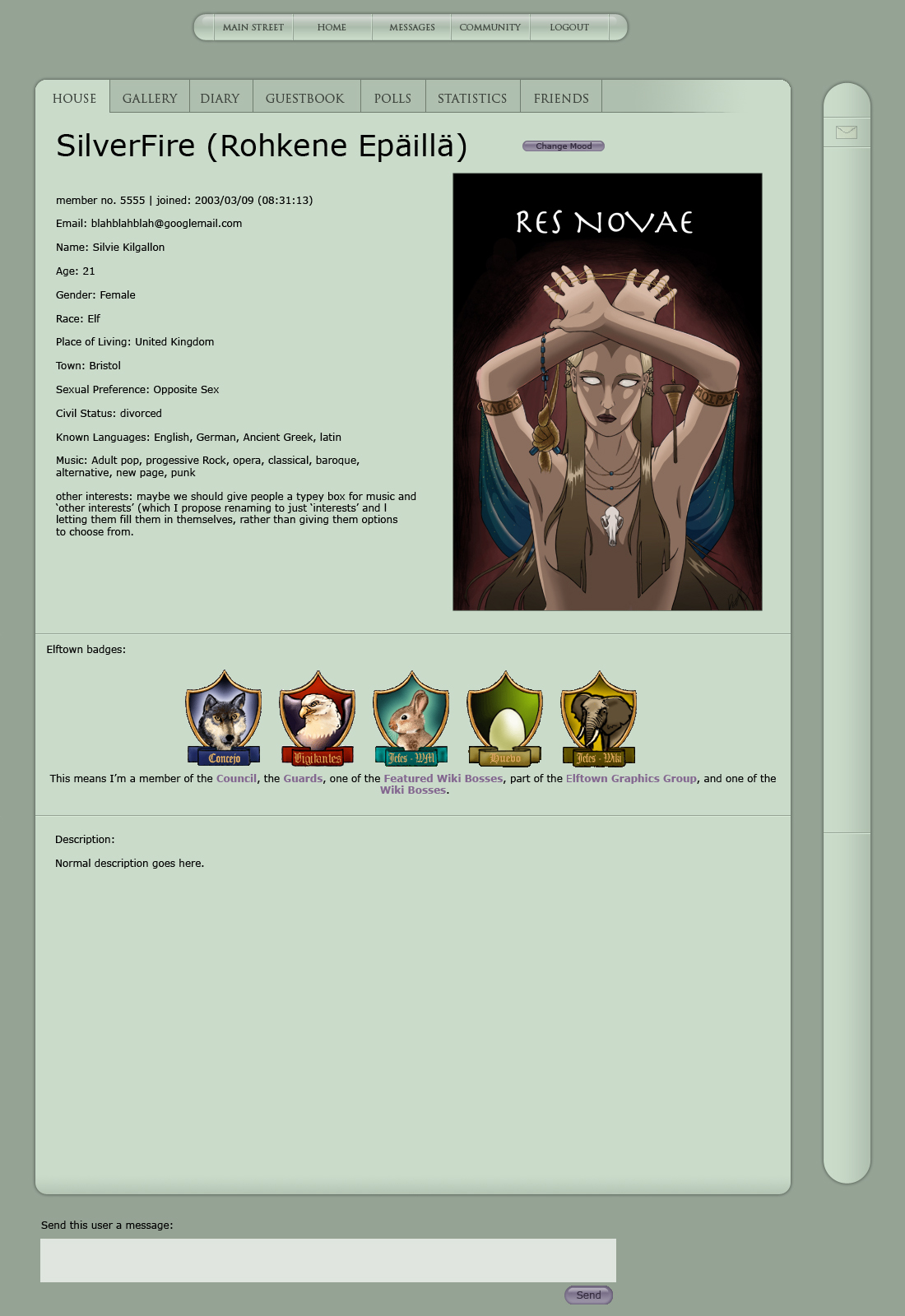
Re-skins of the above:
Design with IE6 style to deal with transparency:

Graphic application of these skins
Please note: Logo & graphic in top left corner are placeholders and screenshots. Concept calls for a monochromatic graphic combined with bright green logo. Ideally, logo would be redesigned entirely, and graphic would wrap around it.
Graphic concepts include:
- Gnarled bonsai growing around logo
- Griffin gripping logo in it's claws
- etc. This could be a contest!

Previous concepts for graphic application:
1. I first went for grey and golden tones, as that's what I already use.

2. Then moved on to dark grey, green tones, more in the elfwood tradition.

3. Then a desaturated brown and green theme, which everyone seems to like.

Suggestion for top nav and what should appear in drop-down menu:
Main Street
- News
- Main Street Poll
- Daily Poem
- Featured Story
- Featured Art
- Featured Member
- Featured Wiki | Your House
-profile
-diary/blog/journal
-guestbook
-poll
-statistics | Messages
-Wheeee! x new messages!
-inbox
-outbox
- view unread messages | Notes
- Friend list?
- the list of wikis you're watching/owning, etc.
- List of houses you're watching
- List of forums you'rer a member of (should take you to the page where you can edit forum prios, etc.)
- possibly a link to help page? | Forums
- Forum replies
- list of forums
- more stuff... need to think more about this part. | Wiki
- Index
- Wiki Help
- Community (community index page)
- Competitions? (maybe would go somewhere else better?) |
Notes: at the moment I've listed 'profile' under the 'Your House' option, 'cause 'Your House' refers to all the options - your poll page diary, gb, etc. I thought it would be confusing to call both the whole lot, and just the profile page 'house', but what does anyone else think?
One potential problem is that the 'wheee, new messages' won't be immediately apparent unless people hover over that option to the ddm. The solutions I see are: either make it so that when you have unread messages, that tab in the nav bar glows to let you know - this could also work for the main street tab to let people know about new polls, features, and news. Or keep the message icon in the right hand nav bar, where it would light up on receiving a new message, and hovering over it would produce the various options (perhaps more clearly explained than they are now - e.g. people have to figure out for themselves that clicking the number part of the link takes you to a list of unread messages, rather than to your first unread message)
If we do that, should it still be listed as an option in the top nav?
Suggestions for renaming of the 'fan' button:
- Keep it as fan/stop fancy
- Fan/Unfan
- Fancy/ Stop Fancy
- Approve/Disapprove
- Yarr!/Narr!
- Yarp/Narp
- Love/Unlove
-Like/Dislike
- I hate that feature!
Feel free to suggest others in the comments!
Suggestions for the side nav: what should be in it, how should it work, how should it look like
IN IT
1. Everything incoming to you:
-New messages <URL:stuff/558MessageNotificationredeg.png> The actual layout of the bubble needs to be figured out.
-New guestbook messages (clicking the icon just takes you straight to your guestbook)
-New forum replies <URL:stuff/558forumNotificationRedeg.png>
-New friend requests <URL:stuff/558relationNotificationRedeg.png>
2. Everything you want to be notified of:
-Wiki changes
-Wiki comments
-(Possibly wikis with both changes and comments? Possibly pointlessly complicating life...)
-Diaries by people you watch
-Changes to presentation by people you watch
-(New polls by people you watch?)
-Comments on polls that you watch
3. Main street features? Or would they be better in the top nav?
-New news would be pretty useful to have in this bar, actually, even if all other main street stuff is not.
4. The bookmarks you have selected to be visible on every page.
(This is a really loved and used feature, and it needs to go somewhere, somehow!)
HOW IT WORKS
-not on hover. I don't think you can hover on phones.
-first click reveals more options, second click is the selection of where you want to go. Unless one click is enough, like in case of the guestbook
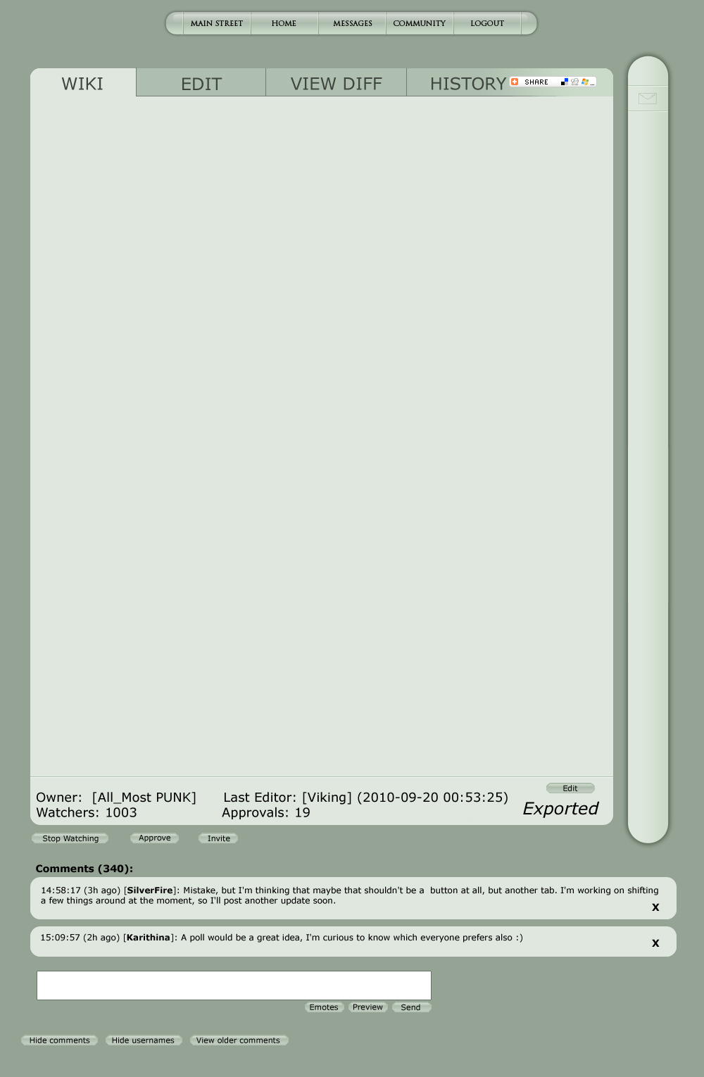
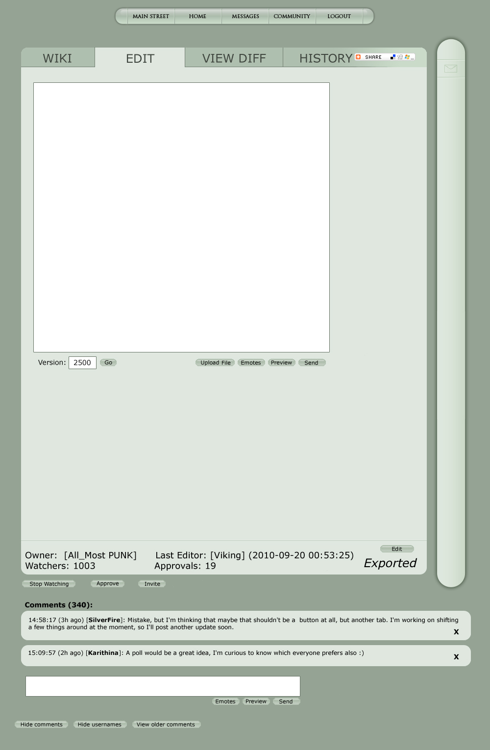
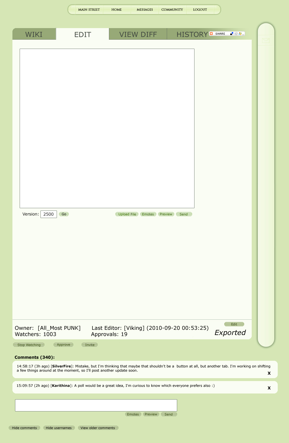
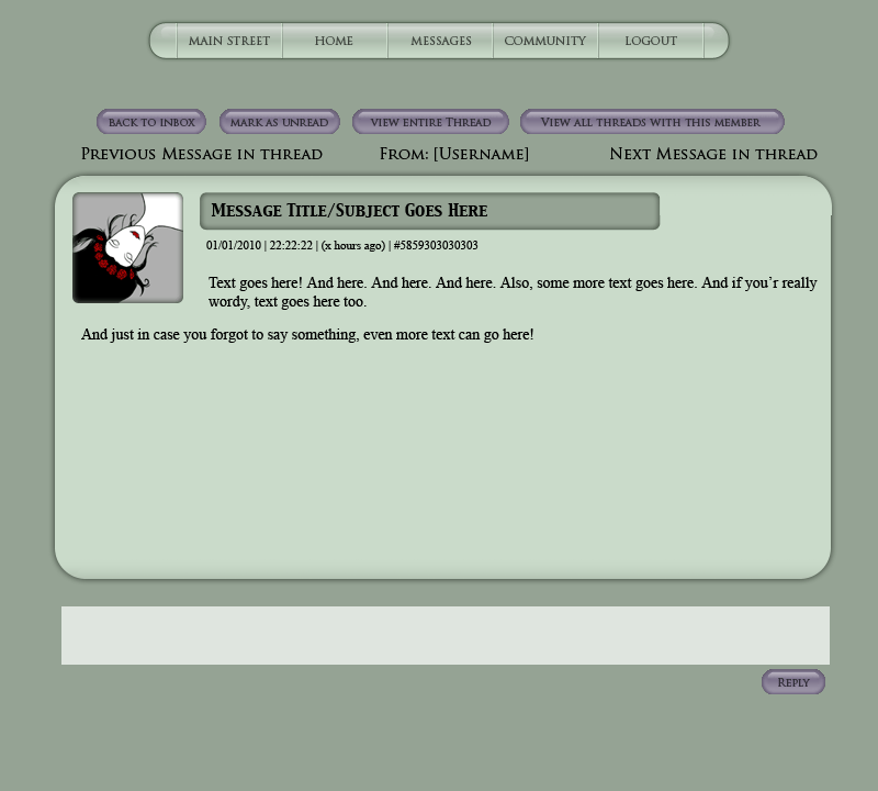
Working with what ET already looks like
|
| Show these comments on your site |
 Stumble!
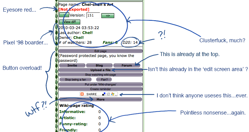

 [Triola]